Taylored Society Weddings & Events

Branding, Art Direction, Web Design

for

Taylored

in

2026

Taylored Society is an event planning company founded by Taylor Edwards, designing weddings, corporate events, and festivals built to feel like nothing else on the calendar. For a while, though, the events were landing and the bookings weren't — and the reason kept showing up in the same sentence on inquiry calls: people liked Taylor, but her brand wasn't telling them who she was. Taylored Society needed a rebrand, and it needed to actually sound like the person running it.

A Grand Experience with Whimsy

The challenge was to build a brand identity for Taylored Society that matched the company's real purpose — designing whimsical, one-of-a-kind events, not off-the-shelf ones. Whatever came next needed to sound and feel like Taylor the moment someone landed on the site, not several clicks into a portfolio.

A Purposeful Rebrand in the Voice of its Owner

The solution was a complete rebrand — a new logo, a new color identity, and a new website built from the ground up around Taylor's actual voice instead of a generic events-industry template. Every piece was designed to work together, so a visitor's first impression finally matched the person they'd eventually get on a call.

“We wanted people to feel a grand experience and a sense of whimsy when coming to Taylored Society”

Micah Wells, Founder & Creative Director at L'Atelier

A Brand Matching the Experience

Taylored Society launched with a brand-new identity — logo, color palette, and website — built to match the company Taylor actually runs. Clients have since told her the new brand finally feels like her, closing the exact gap between a first impression and the person they meet on a call.

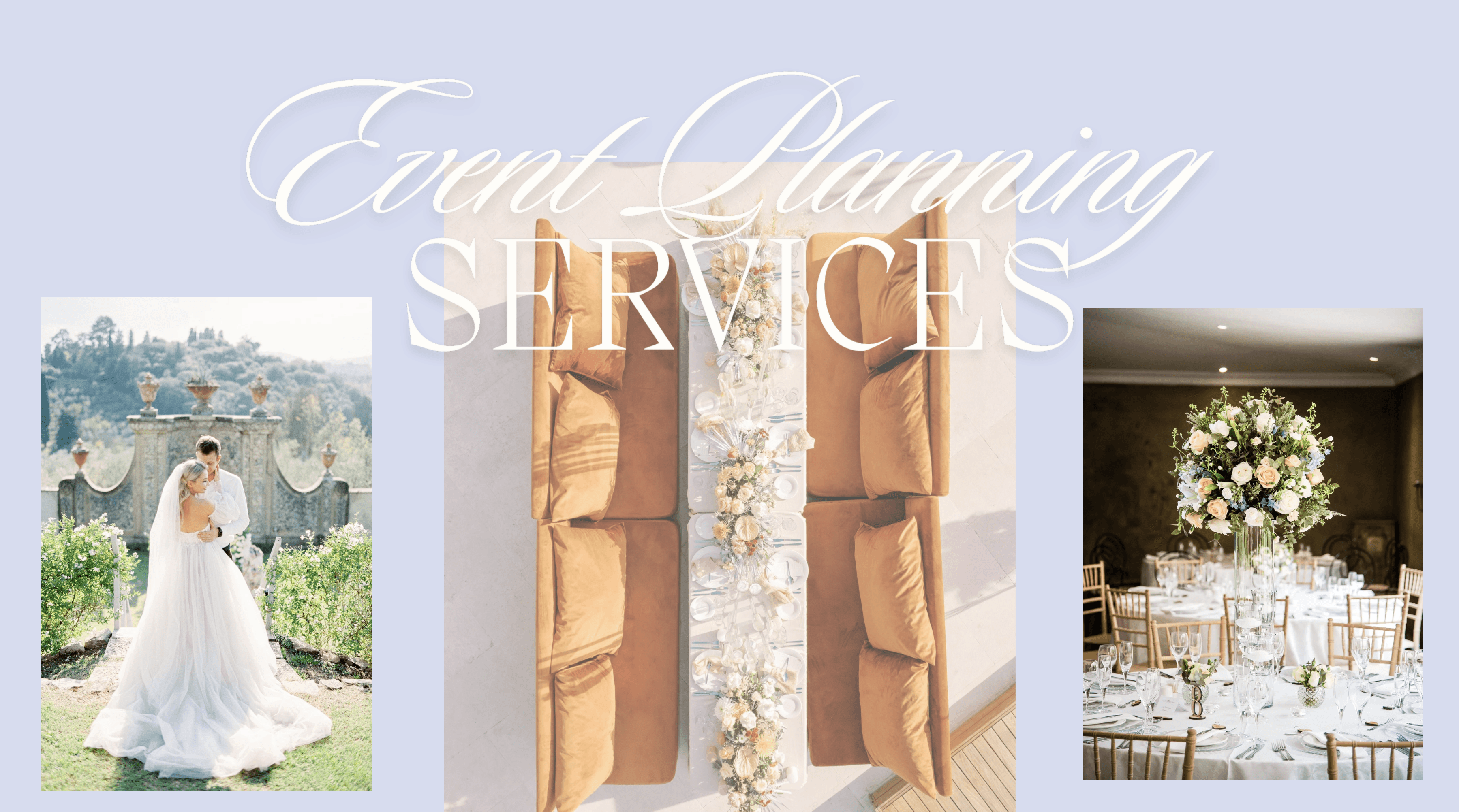
Taylored Society brand and website design for a wedding and event planning studio.
0:00 / 0:00
Taylored Society brand and website design for a wedding and event planning studio.
0:00 / 0:00

A Grand Experience with Whimsy

The challenge was to build a brand identity for Taylored Society that matched the company's real purpose — designing whimsical, one-of-a-kind events, not off-the-shelf ones. Whatever came next needed to sound and feel like Taylor the moment someone landed on the site, not several clicks into a portfolio.

A Purposeful Rebrand in the Voice of its Owner

The solution was a complete rebrand — a new logo, a new color identity, and a new website built from the ground up around Taylor's actual voice instead of a generic events-industry template. Every piece was designed to work together, so a visitor's first impression finally matched the person they'd eventually get on a call.

“We wanted people to feel a grand experience and a sense of whimsy when coming to Taylored Society”

Micah Wells, Founder & Creative Director at L'Atelier

A Brand Matching the Experience

Taylored Society launched with a brand-new identity — logo, color palette, and website — built to match the company Taylor actually runs. Clients have since told her the new brand finally feels like her, closing the exact gap between a first impression and the person they meet on a call.